Use Case
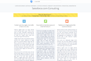
You have a community and you would like to Alert users of an upcoming event.
Requirements
- Be able to show an alert message in a community.
- The alert should be time-based. You should be able to schedule when it will start appearing to customers and when it will stop showing.
- There are varying levels of alerts. Some alerts are informational others are critical.
- Support multi-language.
- There can be more than one alert at a time.
- Different pages can show different sets of alerts.
Approach
Create a custom lightning component that can be used within a community. The component will have a controller that will query a custom object that holds the alerts, the language, the alert level and the date times the alert should be shown.
So let’s get into the coding.
At the bottom of this post, you will find a link to the Git Repository where you will find a DX Project containing the meta-data and source. You can use the project with a DX enabled org, or copy paste to create your own component.
Custom Object
First, create a custom object “Community Alerts” with the following fields:
| Label | Type | Comments |
| Component Name | Text 100 | Used in the component to find which set of alerts to display for a specific instance of the Alert Component |
| Details | Text Area 1000 | The alert text |
| Expiration Date | Date | The date you want the message to show until |
| Start Date | Date | The date you want it to start showing |
| Type | Picklist | What type of alert. Values are Default, Success, Error, Warning. Controls the background color of the alert. |
| Language | Picklist | Allows for support of multiple languages. If a single language is being used then just leave this value blank. If multilanguage, the language will need to be in the URL so the component can pick it up and pass it to the server side controller. |
If you are building this you will want to create a Tab and probably an App so that you can access and create alerts. For more details on how to use Community Alerts visit this post.
Server side controller
The lightning component relies on a very straightforward server side controller so let’s get that out of the way. Notice that the component name and language are passed from the component to the controller can retrieve the appropriate alerts that a particular instance of the component is asking for.
|
1 2 3 4 5 6 7 8 9 |
public without sharing class CommunityAlertsService { @AuraEnabled public static List<Community_Alerts__c> GetAlerts(string componentName, string language) { List<Community_Alerts__c> alertList = [select Name, Details__c, Type__c from Community_Alerts__c where Component_Name__c = :componentName and Start_Date__c <= TODAY and Expiration_Date__c >= TODAY and Language__c = :language]; return alertList; } } |
Lightning Component Bundle
Now onto the Lightning component itself. There are much better places to learn about how to build lighting components so let’s just give the code here and talk about some highlights.
Component highlights:
The componentName is set in the community where the component is being used.
The alerts attribute is a list so it can show more than one alert.
|
1 2 3 4 5 6 7 8 9 10 11 12 13 14 15 16 17 18 19 20 21 22 23 |
<aura:component controller="CommunityAlertsService" implements="forceCommunity:availableForAllPageTypes,flexipage:availableForAllPageTypes" access="global"> <aura:attribute name="componentName" type="string"/> <aura:attribute name="alerts" type="List"/> <aura:attribute name="language" type="String"/> <aura:handler name="init" value="{!this}" action="{!c.doInit}"/> <div class="slds"> <aura:iteration items="{!v.alerts}" var="alert" indexVar="idx"> <div class="slds-notify_container cme-alert_container"> <div class="{!join(' ','slds-notify slds-notify--alert slds-theme--alert-texture', alert.Style)}" role="alert"> <div class="slds-notify__content slds-grid"> <div class="slds-col slds-align-middle"> <div class="slds-text-heading--medium">{!alert.Name}</div> <aura:unescapedHtml value="{!alert.Details__c}" /> </div> </div> </div> </div> </aura:iteration> </div> </aura:component> |
Controller. Not much to talk about here.
|
1 2 3 4 |
doInit : function(component, event, helper) { helper.doInit(component, event, helper); } }) |
Helper. Things to note here.
- The language is retrieved from the URL and passed to the server side controller. See the notes included in the object definition.
- setLanguage is parsing the url looking for the language parameter.
|
1 2 3 4 5 6 7 8 9 10 11 12 13 14 15 16 17 18 19 20 21 22 23 24 25 26 27 28 29 30 31 32 33 34 |
({ doInit : function(component, event, helper) { this.setLanguage(component); var language = component.get("v.language"); var action = component.get("c.GetAlerts"); var componentName = component.get("v.componentName"); action.setParams({"componentName":componentName, "language":language}); action.setCallback(this, function(actionResult) { var data = actionResult.getReturnValue(); var dataEx = data.map(function(alert) { if ("default" !== alert.Type__c.toLowerCase()) { alert.Style = "slds-theme--"+alert.Type__c.toLowerCase(); } return alert; }); component.set("v.alerts", dataEx); }); $A.enqueueAction(action); }, setLanguage: function(component) { var search = window.location.search; if (search.length > 0) { var params = search.replace("?","").split("&"); for(var q = 0; q < params.length; q++) { if (0 < params[q].indexOf("language")) { var kvp = params[q].split("="); component.set("v.language", kvp[1]); break; } } } } }) |
The design code exposes the component name so the user of the component can set the component name to match the data.
|
1 2 3 |
<design:component label="CME Community Alerts"> <design:attribute name="componentName" label="Component Name" description="Component Name of Community Alerts that should be displayed" /> </design:component> |
And finally, here is the styling. This is how the background colors are set up.
|
1 2 3 4 5 6 7 8 9 10 11 12 13 14 15 16 17 18 19 20 21 22 23 24 |
.THIS { margin-top: 6px; } .THIS .cme-alert_container { position: inherit; margin-bottom: 6px; } .THIS .slds-notify { background-color: #3498DB } .THIS .slds-theme--success { background-color: #2fcc66; } .THIS .slds-theme--error { background-color: #c23934; } .THIS .slds-theme--warning { background-color: #ffe55d; } |
Here is a link to the Git Repository where you will find a DX Project containing the meta-data and source. You can use the project with a DX enabled org, or copy paste to create your own component [ConsultingME / Alerts].


